List view
Table of contents
A list view can be linked with a detail view. Tapping on a list item opens the linked detail view. Two types of detail views can be used in this case:
- Pop-up page (best for phones)
- In-page detail view (best for tablets)
Pop-up detail
A pop-up page opens on top of the current page, tapping the “Back” button closes it.
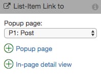
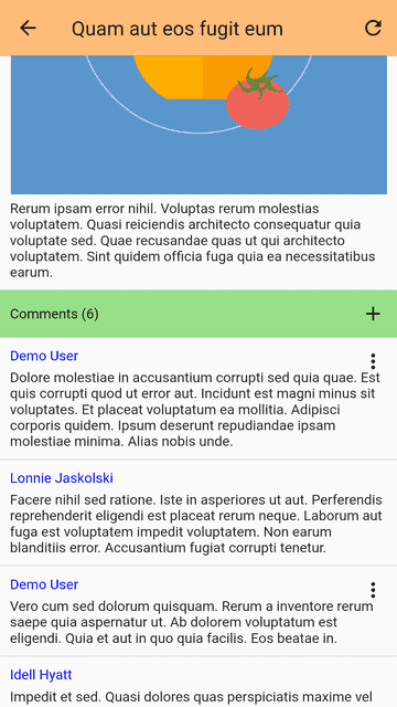
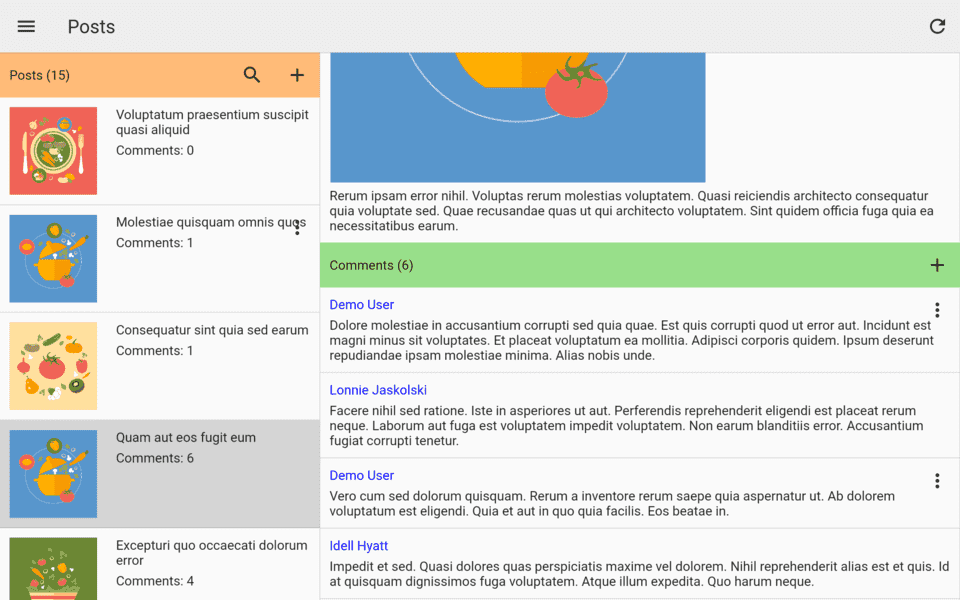
In-page detail
The list view and item detail sit side by side on the same page, tapping a list item loads the selected item in the detail view.
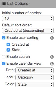
Sort
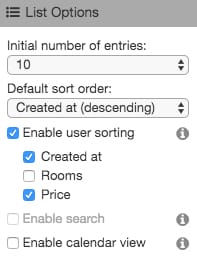
List items are sorted by the created time by default. You can sort the list based on your own data field or let your users change the sort order.
- make data fields sortable by setting the “sortable” property
- select a data field to be the default sort order
- check “Enable user sorting” and select the data fields that are available to your users
Search
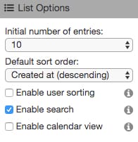
List items can be searched among text fields. The search function can be enabled as follows:
- make data fields searchable by setting the “searchable” property
- check “Enable search” in the list settings
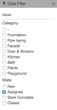
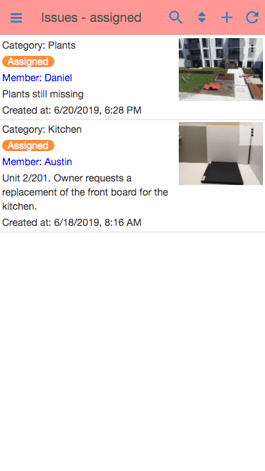
Data filter
List items can be filtered with certain criteria. For instance, if you have a “Work Item” model, you can create a separate list based on status “New”, “In Progress”, or “Done”.
- define the data field with the type “Choice” and its selection values
- check the selection values you want to use as the filter in the list settings
if no selection value is selected, the list will be unfiltered.
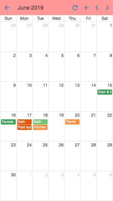
Calendar view
List items can be displayed in a calendar view. The created time is used as the date by default. You can also use your own date field. The calendar view can be enabled as follows:
- check “Enable calendar view” in the list settings
- select the date field and text label
If the data model has a “Choice” field with custom colors for the selection values. The color can be used in the calendar view.