Responsive design: Tablet & PC
Table of contents
Modern applications need to look great and function seamlessly across devices of all form factors—from compact smartphones to large tablets and desktop displays. In Doypp, you can build unified or device-optimized layouts with built-in responsive controls.
Unified vs. device-specific layouts
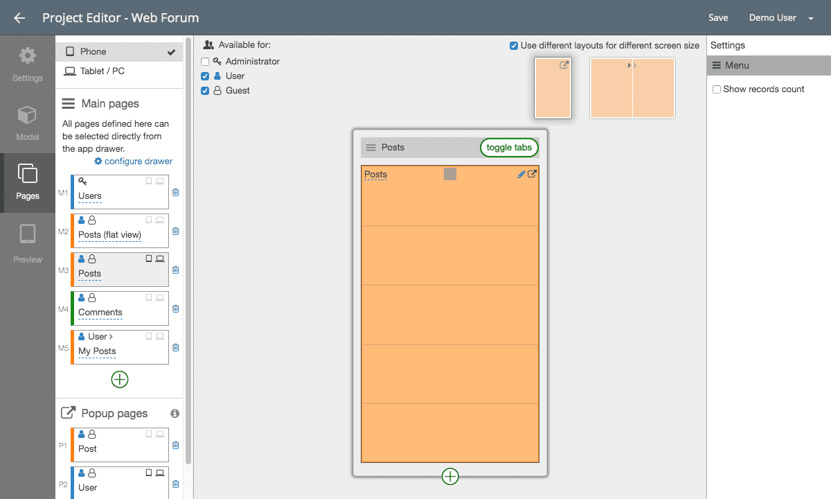
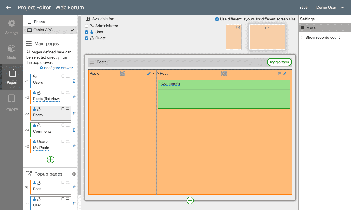
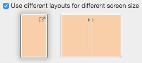
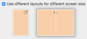
When you create a new page, Doypp applies the same layout across all screen sizes by default. However, you can toggle “Support different screen sizes” to unlock dedicated layout configurations tailored specifically for phones versus tablets:
Responsive optimization strategies
Depending on the device screen size, you can optimize your user experience in several ways:
- Adaptive Presentation Patterns: Use modal pop-up pages on phones to maintain focus, while utilizing dual-pane master-detail views on tablets to take advantage of wider screens.
- Rearranging Layout Elements: Group elements into 2 or 3 side-by-side columns on tablets while stacking them linearly on phones.
- Adjusting Information Density: Expose secondary fields and summary metrics on larger screens while keeping mobile feeds clean and concise.
Pattern Comparison: Phone vs. Tablet
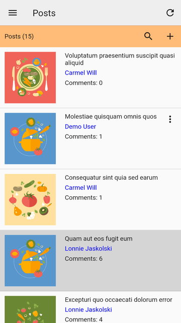
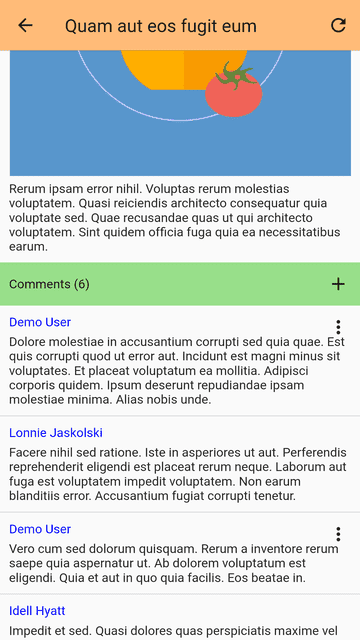
1. Phone Experience: List + Modal Popup
On mobile devices, tapping an item opens a focused pop-up detail page over the list:
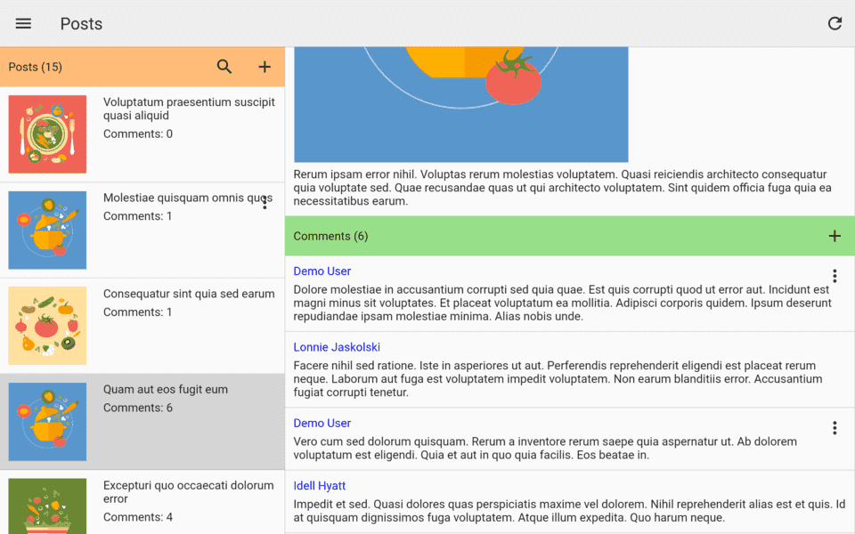
2. Tablet & PC Experience: Master-Detail Split Screen
On wider screens, the list and detail panels appear side by side on the same page, allowing users to browse and inspect items simultaneously:
[!WARNING] Disabling Multi-Device Screen Support: If you toggle off “Support different screen sizes”, the layout currently selected in your editor will become the single layout applied to all screen sizes, and custom arrangements made for the other size will be discarded. Ensure you have selected the preferred layout before disabling this setting.
Related Topics
- Implement master-detail split views in List Views.
- Organize responsive columns and tabs in Page Elements.
- Learn page navigation structures in Pages.