Page elements & layout components
Table of contents
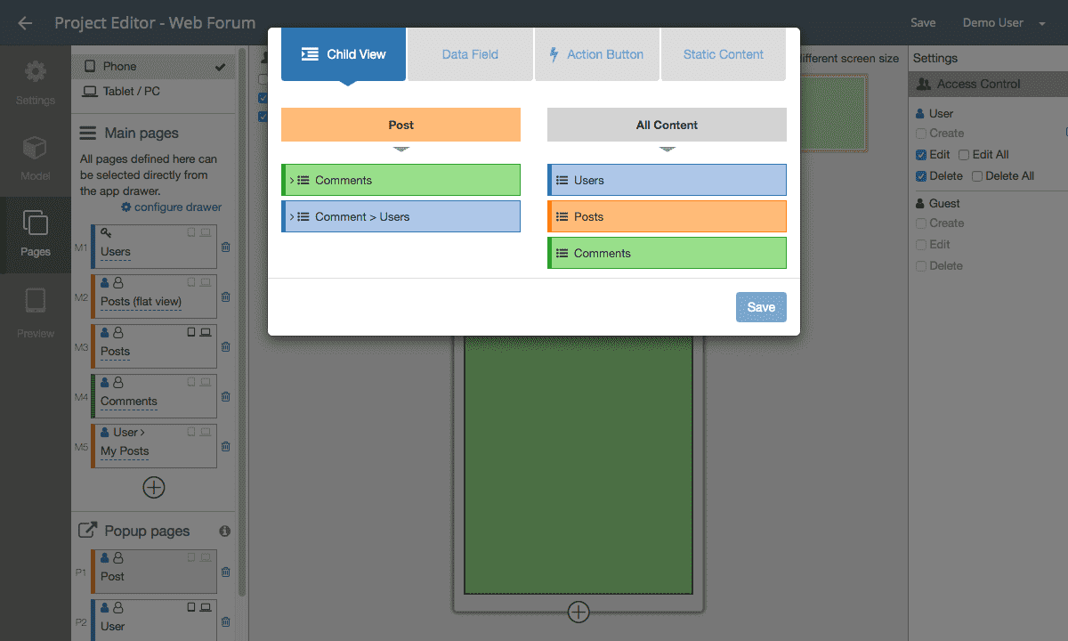
Page elements are the modular building blocks used to construct views and screens. In Doypp, you can combine four core element types to design rich, interactive interfaces:
- Child views: Embedded sub-views displaying related child records (e.g., comments on a post).
- Data fields: Dynamic elements bound to your data model (e.g., title, avatar, price, location).
- Static content: Non-database assets for branding and structure (e.g., banners, help text, static maps).
- Action buttons: Interactive triggers for status transitions, workflows, and submission forms.
Multi-column layouts
Page elements can be organized into responsive columns. A page—as well as individual views inside a page—supports up to 3 columns:
- Drag-and-Drop Positioning: Move elements between columns using the drag handle.
- Adjustable Column Widths: Adjust proportional column widths by dragging the splitter between columns.
- Adaptive Stacking: Multi-column layouts automatically condense into single-column vertical flows on small smartphone screens while preserving side-by-side presentation on tablets and desktop browsers.
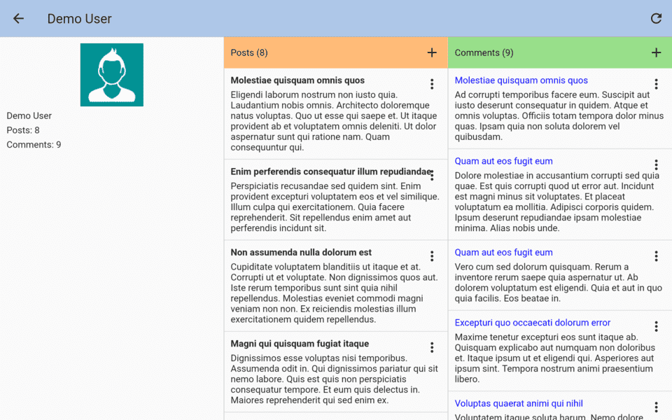
Example: 1-column, 2-column, and 3-column layouts of a User profile screen:
Tabbed views
When a view contains numerous fields and related lists, stacking them vertically can force users into tedious scrolling. Enabling a Tab view organizes sections into clean, horizontal tab headers.
To enable tabs, click the “Toggle tabs” button in the view editor, then group your elements into distinct tabs (such as Profile, Posts, and Comments):
Child views
A Child view is a view embedded inside a parent page or card to display related records via direct or indirect relationships:
Pattern 1: Embedded Child List on Detail Pages
On a post detail screen, embed a child list view displaying all comments associated with that post:
Pattern 2: Nested Child Lists inside Cards
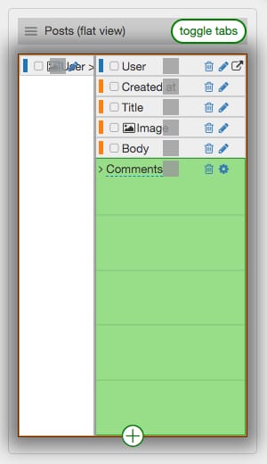
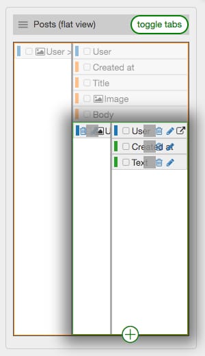
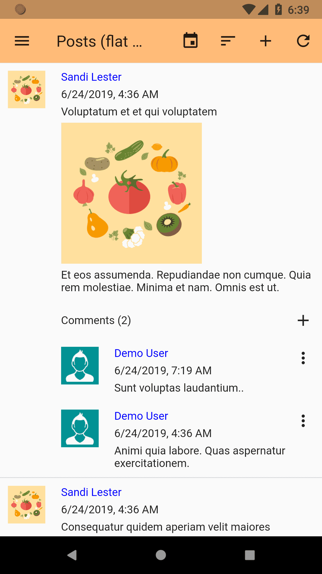
Rather than requiring users to open a popup to inspect child items, you can nest child lists directly within parent cards in a feed:
[!TIP] A single page can contain multiple child views simultaneously (e.g., an Order detail page holding both a
Line Itemslist and aShipping Updateslist).
Dynamic data fields
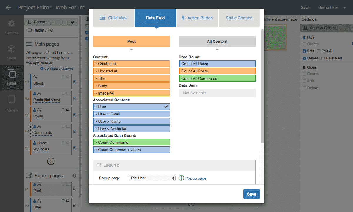
Dynamic fields display live data stored in your models:
Linking Fields to Pop-up Pages
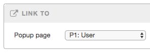
Just like list items, dynamic fields representing related entities can be configured as interactive links that launch pop-up detail pages.
Example: Tapping the author name on a post card opens that user’s profile popup:
Field Styling: Bold Text & Text Alignment
Customize the visual weight and alignment of data fields using the display settings toolbar:
- Bold Styling: Emphasize headings, titles, or metrics.
- Alignment: Align content to the left, center, or right (e.g., right-aligning currency or numeric quantities).
Static content
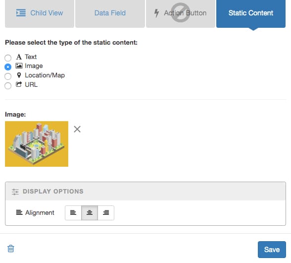
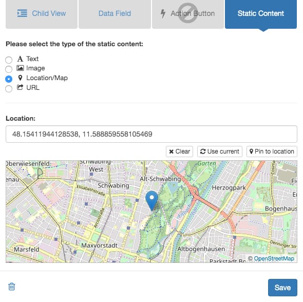
Static elements do not bind to database records; they provide fixed headings, instructions, imagery, and external navigation:
- Static Text: Headings, section dividers, instructions, and disclaimers.
- Static Image: Logos, hero illustrations, and decorative banners.
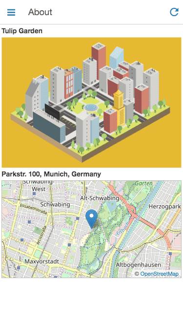
- Static Location / Map: Fixed physical office locations, venue maps, or meeting points.
- Static URL: External links to documentation, privacy policies, or external web services.
Action buttons
Action buttons trigger specific application operations with a single tap. They are commonly used for two major workflows:
1. Adding Private Sub-Records
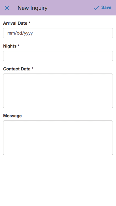
Launch an input form for a child model without having to display the complete list of existing records on that page.
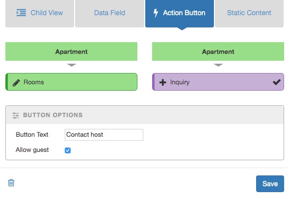
Example: An apartment listing features a “Contact Host” button that lets visitors send private inquiries to the host without displaying the entire history of past inquiries publicly:
2. One-Tap Status Updates & State Transitions
Update a record’s state or advance a workflow directly without requiring the user to open and submit an edit form.
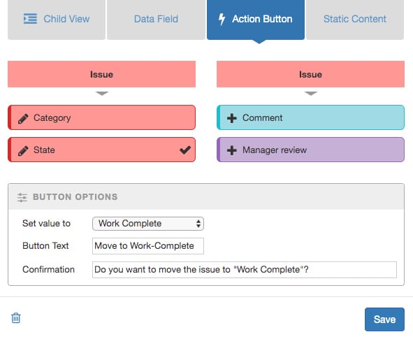
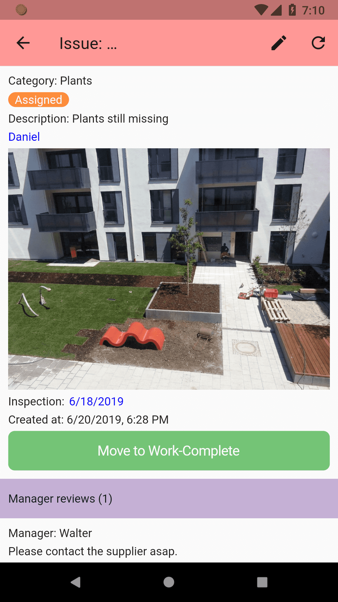
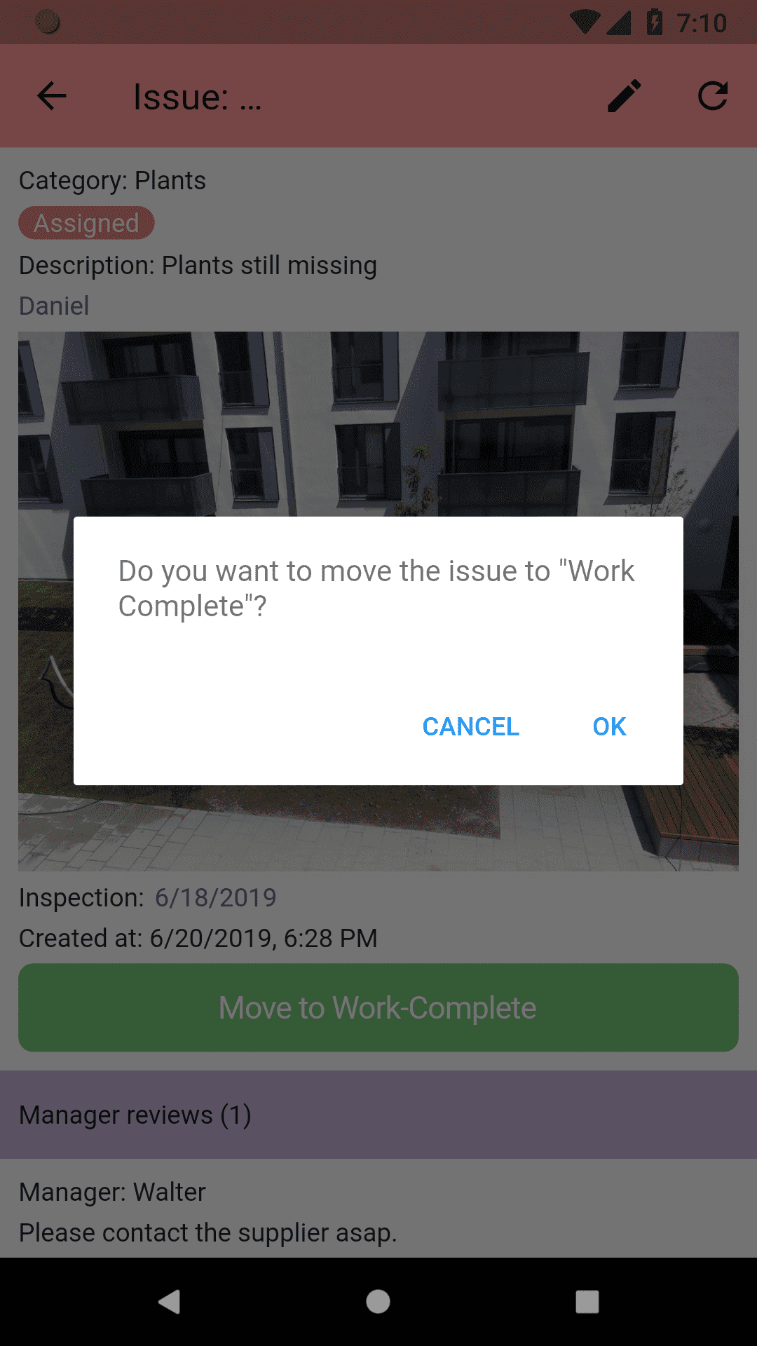
Example: A maintenance technician taps “Work Complete” to advance a task from Assigned to Completed: